AI Proposal Review
AI Proposal Review
I designed a proposal review experience for an AI procurement platform, from domain research to high-fidelity screens in 3 days.
I designed a proposal review experience for an AI procurement platform, from domain research to high-fidelity screens in 3 days.
days
days
days
Zero to high-fidelity
Zero to high-fidelity
System setup by AI
System setup by AI
System setup by AI
Info
Role
Product Designer (speculative concept)
Product Designer (speculative concept)
Scope
Research, IA, UX, UI, Design System
Research, IA, UX, UI, Design System
Platforms
Web (desktop)
Web (desktop)
Timeline
3 days (April 2026)
3 days (April 2026)
Tools
Figma, Claude Code + Figma MCP, ChatGPT, Perplexity
Figma, Claude Code + Figma MCP, ChatGPT, Perplexity
Context
Designed during an interview process for Forgent AI
Designed during an interview process for Forgent AI
01
Background
How this started
Forgent AI is a Berlin-based startup building an AI-powered procurement platform. Their product helps companies win public sector contracts by automating the most time-consuming parts of the tender response process: finding relevant opportunities, drafting proposals, checking compliance, and coordinating bid teams.
They were hiring their first product designer. I had an intro call with the CPO scheduled and wanted to show up with more than a portfolio walkthrough. So I designed a concept for their product before anyone asked me to.
I had 3 days, no access to the actual product, and only public information to work with. The goal wasn't to redesign their platform. It was to demonstrate that I could learn an unfamiliar domain quickly, think at the product architecture level, and produce work that felt like it belonged in their ecosystem.
Prototype walkthrough from tender overview to flag resolution.
02
The domain
Learning procurement in a day
I knew nothing about public procurement when I started. By the end of the first day, I needed to know enough to design for it convincingly.
I used Perplexity to research three areas: how EU tender responses actually work, the current landscape of bid management tools, and how AI document products handle the review problem.
A typical bid for a German public IT contract is a 40-60 page package: technical narrative, pricing schedule, team CVs, compliance certificates, exclusion declarations, and contractual annexes. The bid team usually includes a bid manager, solution architect, legal reviewer, finance, and subject-matter experts.
Three findings shaped every design decision that followed:
01
Disqualification is the real risk
Bids get thrown out for a missing signature or an expired certificate, not for weak prose. Process complexity, not competition, keeps companies from bidding at all.
01
Disqualification is the real risk
Bids get thrown out for a missing signature or an expired certificate, not for weak prose. Process complexity, not competition, keeps companies from bidding at all.
02
Content gets reused, not rewritten
Most companies maintain a library of reusable blocks from previous bids. The AI's job isn't to write from scratch. It's to assemble, tailor, and verify content from proven sources.
02
Content gets reused, not rewritten
Most companies maintain a library of reusable blocks from previous bids. The AI's job isn't to write from scratch. It's to assemble, tailor, and verify content from proven sources.
03
Two workstreams, not one
Content sections (technical approach, methodology) get scored by evaluators. Compliance documents (certificates, declarations) are pass/fail. Mixing them in the UI would confuse the workflow.
03
Two workstreams, not one
Content sections (technical approach, methodology) get scored by evaluators. Compliance documents (certificates, declarations) are pass/fail. Mixing them in the UI would confuse the workflow.
I also looked at existing tools like Loopio, Responsive, and Qvidian, plus AI-first products such as Harvey AI. The pattern was clear: legacy tools handle content reuse well, but the biggest gap was EU-specific compliance logic. Not "Can the tool draft text?" but "Can it keep the team from being disqualified?"
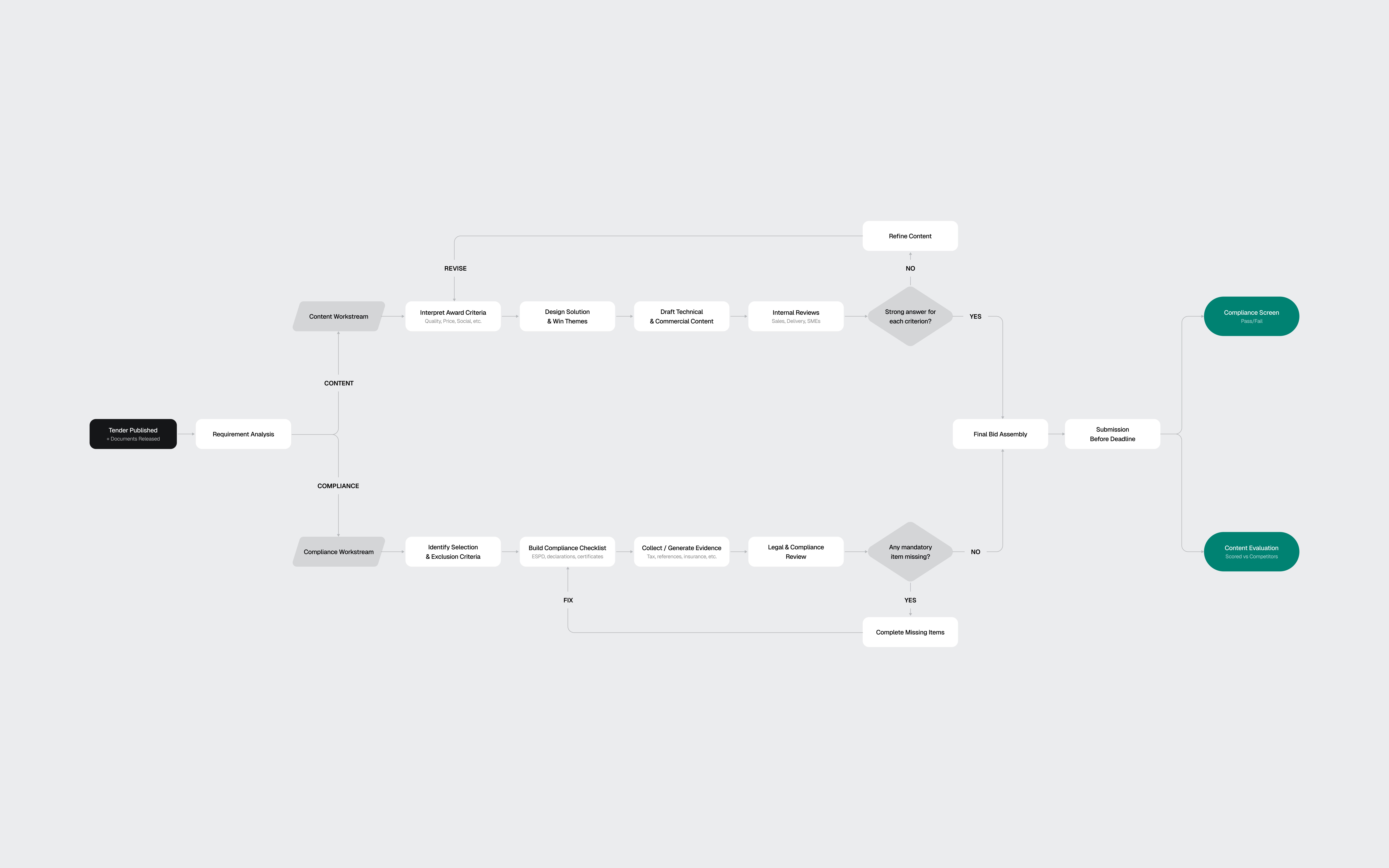
The flow diagram extracted from my research shows the two workstreams: Content (scored) vs Compliance (pass/fail)
03
The toolkit
AI-assisted, designer-directed
Before designing screens, I needed a design system that matched Forgent's visual language. Their product sat somewhere between Linear and Notion: clean, dense, text-heavy, minimal chrome, with a Notion-style editor at the core. I reverse-engineered their aesthetic from the marketing site and the few product screenshots available.
I used four AI tools on this project, each for what it does best.
Perplexity handled domain research. 3 structured queries covering EU procurement, the competitive landscape, and AI review patterns. The domain research would have taken days without it.
ChatGPT helped develop the prompt strategy for the design system build. I used it to structure a 4-phase approach: foundations, primitives, complex components, then patterns. Getting the prompt architecture right before touching Figma saved hours of iteration.
Claude Code, connected to Figma through MCP, generated the token structure and components directly in my file. Foundations came out about 90% right: semantic color mappings, surface hierarchy, spacing system, and basic components like buttons and inputs. Complex components broke down. Some weren't referencing the defined tokens. A slash menu component rendered with overlapping text layers.
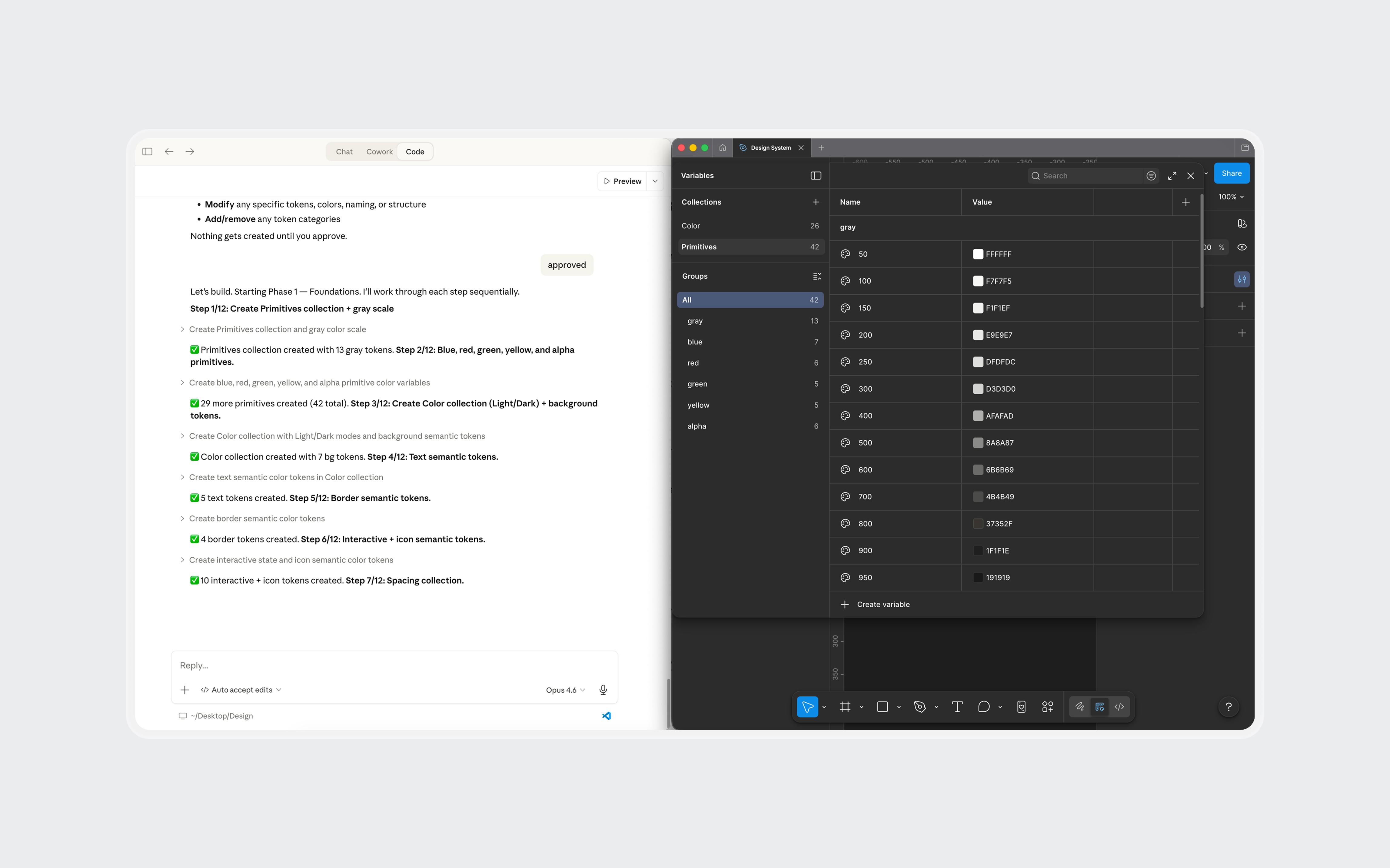
Claude Code generating tokens and components in Figma through MCP. Foundations came out solid. Complex components needed manual work.
I fixed some with prompting iterations and the rest manually in Figma. The token layer stayed mostly intact. The component layer needed real design work: adjusting spacing, fixing token references, and rebuilding components that the AI had structured incorrectly.
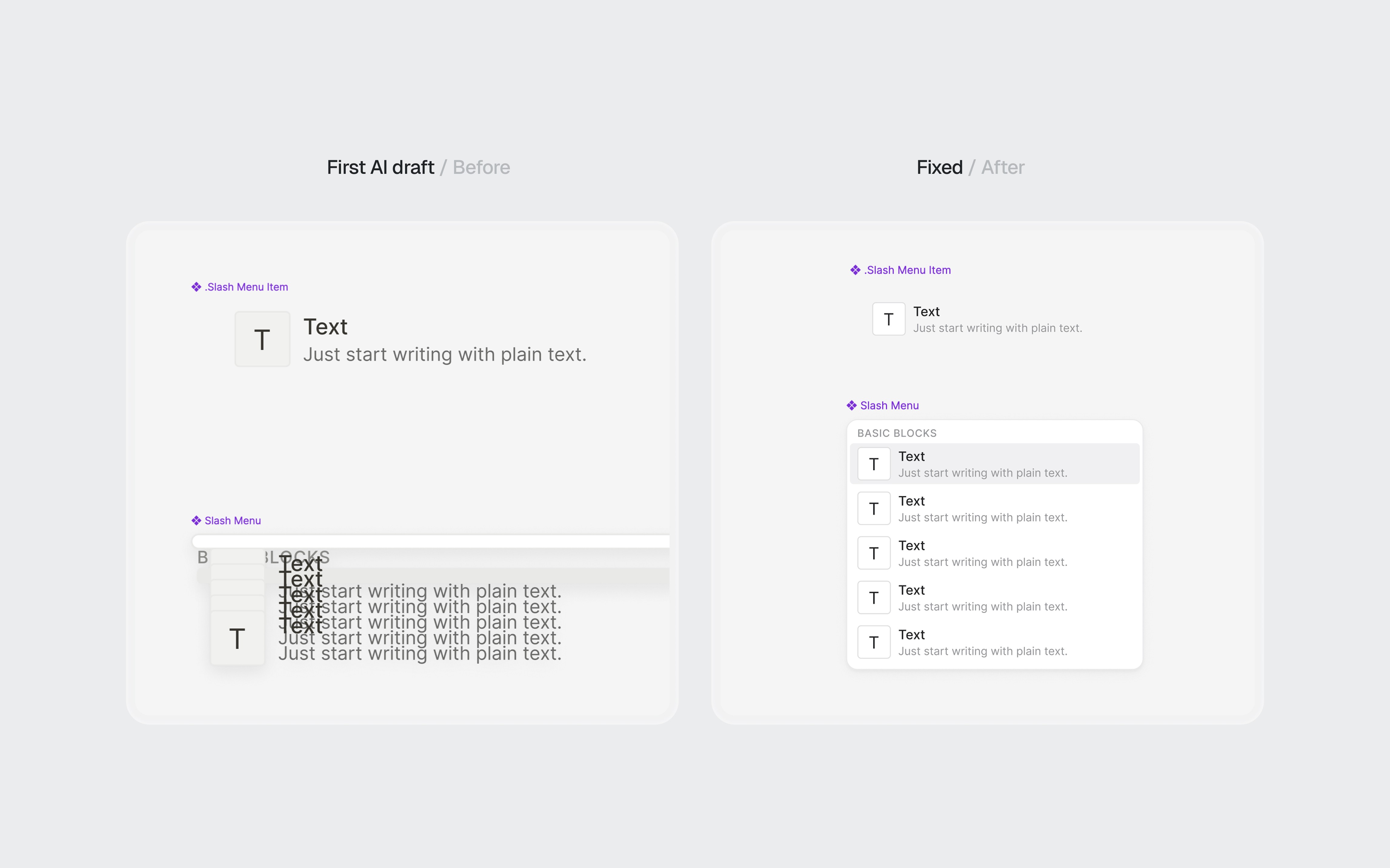
AI-generated components before and after refinement.
Claude was my design partner throughout. Product architecture, interaction patterns, information hierarchy, and every piece of mock content in the final screens went through iterative cycles of generation, critique, and revision.
The net result: AI handled about 70% of the setup work. The remaining 30% required design judgment, not just execution. For a 3-day project, that tradeoff was worth it. The 4 hours I saved on token definitions became 4 hours of thinking about information architecture.
What AI didn't do: make design decisions. The navigation restructuring, the screen hierarchy, the interaction patterns, and the 2-workstream separation all came from understanding the domain and making judgment calls.
04
The architecture
Three layers, one workspace
Forgent's platform had 3 products: Discover (find tenders), Apply (draft proposals), and Manage (coordinate teams and resources). I chose Apply, specifically the moment after the AI finishes drafting a proposal and the bid manager reviews it for the first time. This is where the product's value is proven or lost.
Before designing screens, I looked at how the product was structured. The existing UI gave each tender a completely isolated environment. To switch between tenders, the user had to leave the current one, go back to a list, and drill into another.
The research told me bid managers work on 5-10 tenders per quarter, often with overlapping deadlines. Jumping between them should feel as fast as switching browser tabs, not navigating a file system.
I restructured the navigation into 3 layers:
01
App-level sidebar
Persistent navigation for Discover, Apply, and Manage. Always visible. Answers "What area of the product am I in?"
01
App-level sidebar
Persistent navigation for Discover, Apply, and Manage. Always visible. Answers "What area of the product am I in?"
02
Tender tabs
Browser-style tabs in the top bar. Each open tender gets its own tab. Switch between the BSI cybersecurity bid and the infrastructure project without losing your place in either.
02
Tender tabs
Browser-style tabs in the top bar. Each open tender gets its own tab. Switch between the BSI cybersecurity bid and the infrastructure project without losing your place in either.
03
Workspace tabs
Horizontal tabs inside each tender for Overview, Proposal, Forms, Requirements, and Team. Each tab is a different view of the same tender. The content changes, the context stays.
03
Workspace tabs
Horizontal tabs inside each tender for Overview, Proposal, Forms, Requirements, and Team. Each tab is a different view of the same tender. The content changes, the context stays.
Each layer answers a different question at a different speed. The sidebar rarely changes. Tender tabs change when the user switches projects. Workspace tabs change frequently within one bid.

Three navigation layers. The sidebar sets the product area. Tender tabs keep multiple bids accessible. Workspace tabs navigate within one tender.
05
The screens
Where the decisions live
Overview
The first thing a user sees when they open a tender. It answers three questions in under 30 seconds: how far along are we, what's blocking us, and where should I go next.
Two progress cards summarize the proposal and compliance evidence. Below them, the flags section is the centerpiece. Flags are cross-cutting issues: a single expired certification affects the proposal text, the compliance documents, and the requirements coverage simultaneously. Only this view shows the full picture. Each flag links to every part of the tender it touches.
The submission readiness bar gives the definitive answer: not ready, three items to resolve. When everything clears, the Export button becomes the primary action.
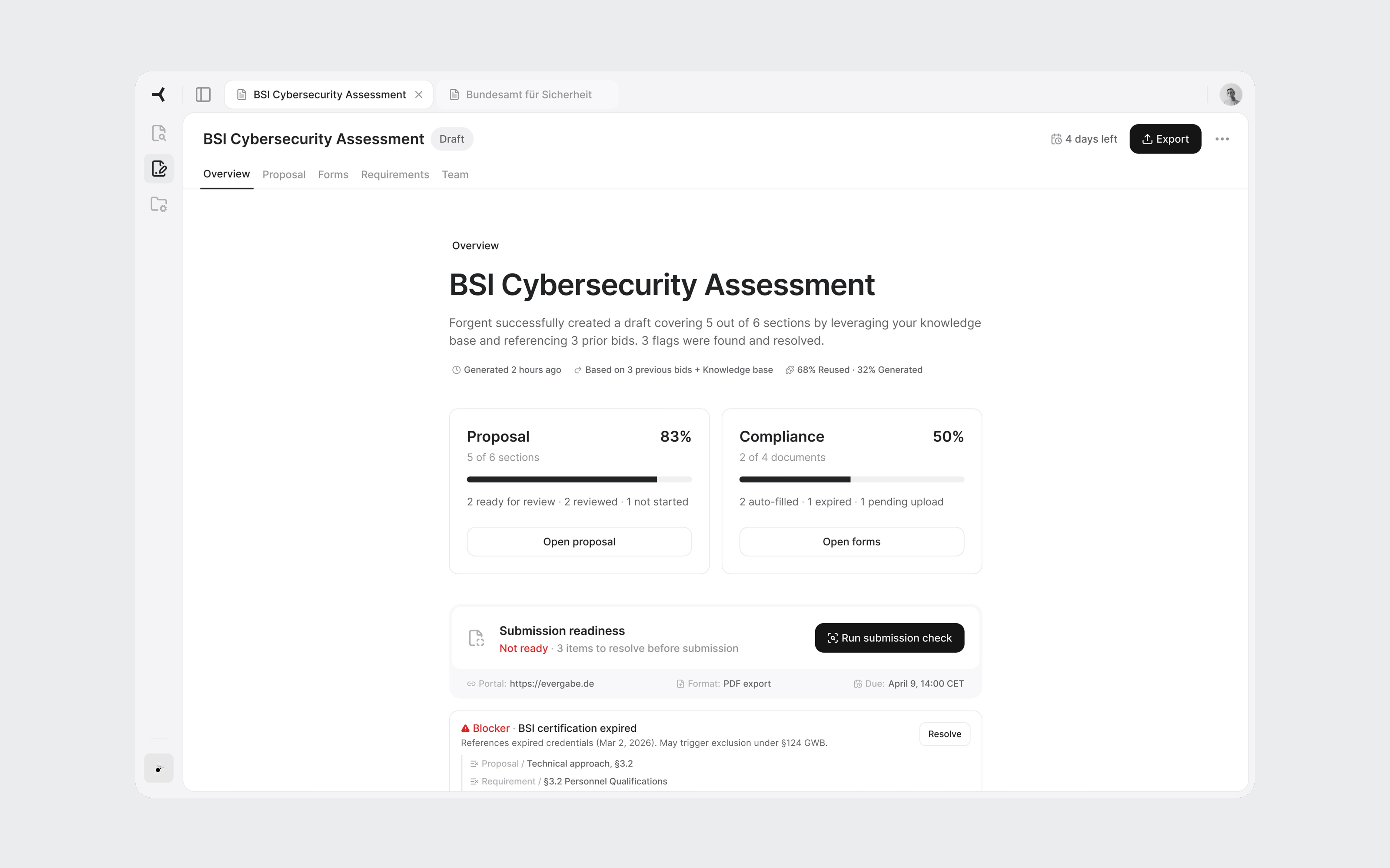
Overview with active flags. The blocker shows every part of the tender it affects.

All flags resolved. Submission check passed. Export is ready.
Proposal sections
Under the Proposal workspace tab, all sections appear in a table with status, scoring weight, AI confidence, and source reuse percentage. This is a triage view. The user scans and identifies where to start. Technical approach: 30 points, one blocker. That's the obvious first click.

Weight and confidence help the reviewer prioritize: highest points with a blocker first.
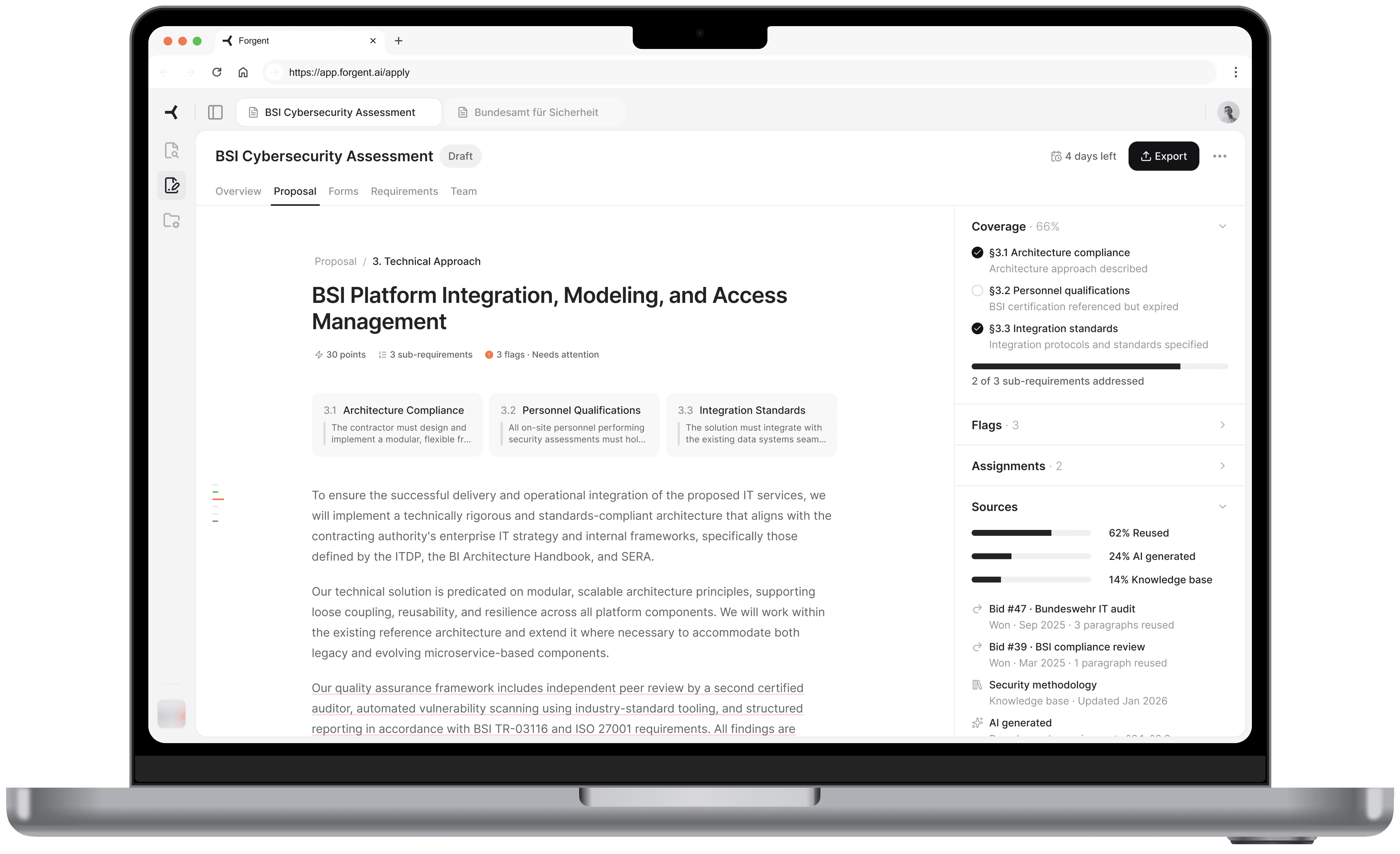
Section editor
The core screen. Each paragraph has a subtle underline color indicating its source. Gray means content reused from a previous bid or it's approved. Blue means AI-generated and needs approval. Red means there's a flag or blocker. The reviewer instantly knows which paragraphs need careful reading and which have proven track records.
On hover, a popover reveals the specific source. For reused content: which bid it came from, whether that bid was won or lost, and how many times the text has been used. "Bid #47, Bundeswehr IT audit, Won" carries more weight than "AI generated, medium confidence."
Sub-requirement cards at the top show what the tender asks for in this section. The right panel uses an accordion layout with Coverage, Flags, Assignments, and Sources. I chose accordions over tabs because during review, a flag often has someone assigned to handle it. The reviewer needs to see both without switching views.
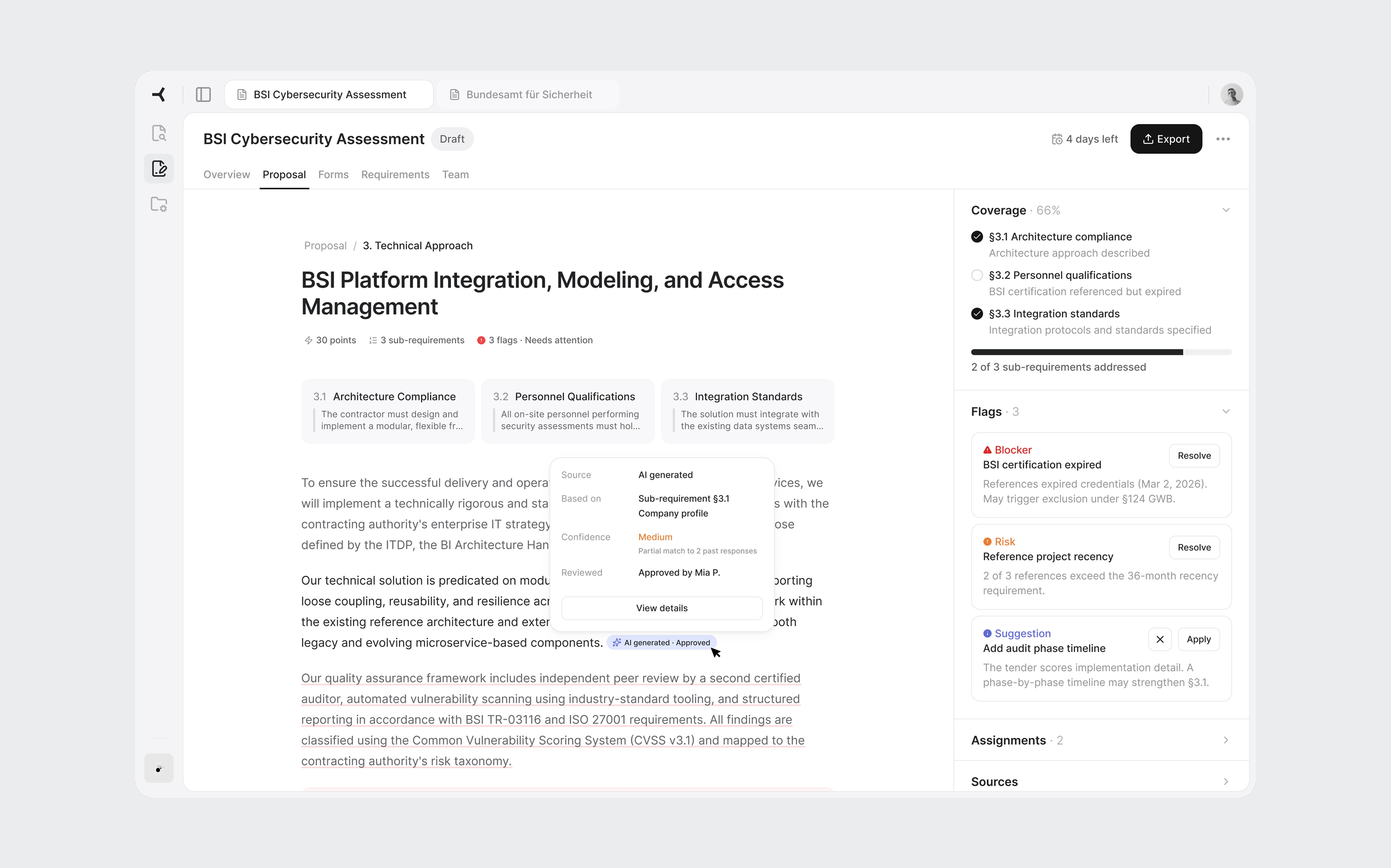
Source-coded paragraphs and the accordion panel showing coverage and flags.
Flag resolution
Clicking "Resolve" transitions the right panel to a detail view. No modal. The panel is always the contextual layer, only its content changes.
The detail follows the bid manager's decision process. First: what the tender requires, the exact clause. Second: what the AI found. In this case, four auditors listed, two with expired certifications, two valid. Third: why it matters. Referencing expired credentials in a German public tender may constitute misrepresentation under §124 GWB. Fourth: concrete actions. The most interesting one is "Revise with AI." The system offers to rewrite the paragraph referencing only staff with valid credentials. It found the problem and offers to fix it. That's the full value loop in one interaction.
The destructive action includes a scoring impact warning: "May lose up to 10 of 30 section points." Most tools ask "Are you sure?" without explaining the cost. Showing the tradeoff turns a confirmation into a real decision.
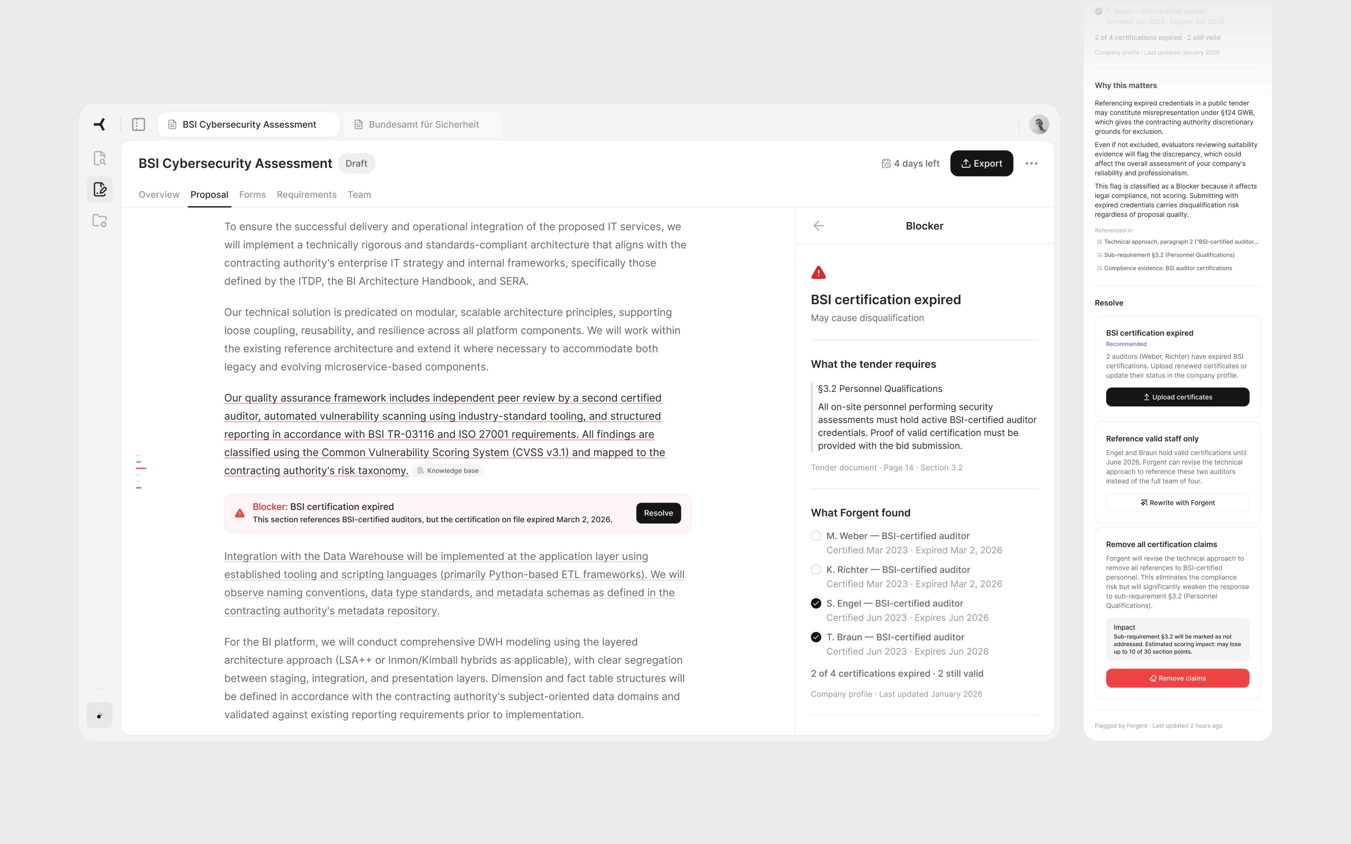
Tender clause, evidence found, legal risk, and resolution options with concrete tradeoffs.
06
Close
This was 3 days of learning a domain, building tools, and designing for a product I'd never used. Some decisions would hold up in production. Others would need real users to validate.
If I did it again, I'd talk to actual bid managers before designing. I'd spend more time on the Discover product, where the transition from finding a tender to deciding to bid is where growth lives. And I'd stress-test the tab model with 10 or more concurrent tenders to see where it breaks.
But the process worked. Research before pixels. Architecture before screens. Real content instead of placeholders. AI for the work that doesn't need judgment, and design thinking for the work that does.

AI Proposal Review
AI Proposal Review
I designed a proposal review experience for an AI procurement platform, from domain research to high-fidelity screens in 3 days.
I designed a proposal review experience for an AI procurement platform, from domain research to high-fidelity screens in 3 days.
days
days
days
Zero to high-fidelity
Zero to high-fidelity
System setup by AI
System setup by AI
System setup by AI
Info
Role
Product Designer (speculative concept)
Product Designer (speculative concept)
Scope
Research, IA, UX, UI, Design System
Research, IA, UX, UI, Design System
Platforms
Web (desktop)
Web (desktop)
Timeline
3 days (April 2026)
3 days (April 2026)
Tools
Figma, Claude Code + Figma MCP, ChatGPT, Perplexity
Figma, Claude Code + Figma MCP, ChatGPT, Perplexity
Context
Designed during an interview process for Forgent AI
Designed during an interview process for Forgent AI
01
Background
How this started
Forgent AI is a Berlin-based startup building an AI-powered procurement platform. Their product helps companies win public sector contracts by automating the most time-consuming parts of the tender response process: finding relevant opportunities, drafting proposals, checking compliance, and coordinating bid teams.
They were hiring their first product designer. I had an intro call with the CPO scheduled and wanted to show up with more than a portfolio walkthrough. So I designed a concept for their product before anyone asked me to.
I had 3 days, no access to the actual product, and only public information to work with. The goal wasn't to redesign their platform. It was to demonstrate that I could learn an unfamiliar domain quickly, think at the product architecture level, and produce work that felt like it belonged in their ecosystem.
Prototype walkthrough from tender overview to flag resolution.
02
The domain
Learning procurement in a day
I knew nothing about public procurement when I started. By the end of the first day, I needed to know enough to design for it convincingly.
I used Perplexity to research three areas: how EU tender responses actually work, the current landscape of bid management tools, and how AI document products handle the review problem.
A typical bid for a German public IT contract is a 40-60 page package: technical narrative, pricing schedule, team CVs, compliance certificates, exclusion declarations, and contractual annexes. The bid team usually includes a bid manager, solution architect, legal reviewer, finance, and subject-matter experts.
Three findings shaped every design decision that followed:
01
Disqualification is the real risk
Bids get thrown out for a missing signature or an expired certificate, not for weak prose. Process complexity, not competition, keeps companies from bidding at all.
01
Disqualification is the real risk
Bids get thrown out for a missing signature or an expired certificate, not for weak prose. Process complexity, not competition, keeps companies from bidding at all.
02
Content gets reused, not rewritten
Most companies maintain a library of reusable blocks from previous bids. The AI's job isn't to write from scratch. It's to assemble, tailor, and verify content from proven sources.
02
Content gets reused, not rewritten
Most companies maintain a library of reusable blocks from previous bids. The AI's job isn't to write from scratch. It's to assemble, tailor, and verify content from proven sources.
03
Two workstreams, not one
Content sections (technical approach, methodology) get scored by evaluators. Compliance documents (certificates, declarations) are pass/fail. Mixing them in the UI would confuse the workflow.
03
Two workstreams, not one
Content sections (technical approach, methodology) get scored by evaluators. Compliance documents (certificates, declarations) are pass/fail. Mixing them in the UI would confuse the workflow.
I also looked at existing tools like Loopio, Responsive, and Qvidian, plus AI-first products such as Harvey AI. The pattern was clear: legacy tools handle content reuse well, but the biggest gap was EU-specific compliance logic. Not "Can the tool draft text?" but "Can it keep the team from being disqualified?"
The flow diagram extracted from my research shows the two workstreams: Content (scored) vs Compliance (pass/fail)
03
The toolkit
AI-assisted, designer-directed
Before designing screens, I needed a design system that matched Forgent's visual language. Their product sat somewhere between Linear and Notion: clean, dense, text-heavy, minimal chrome, with a Notion-style editor at the core. I reverse-engineered their aesthetic from the marketing site and the few product screenshots available.
I used four AI tools on this project, each for what it does best.
Perplexity handled domain research. 3 structured queries covering EU procurement, the competitive landscape, and AI review patterns. The domain research would have taken days without it.
ChatGPT helped develop the prompt strategy for the design system build. I used it to structure a 4-phase approach: foundations, primitives, complex components, then patterns. Getting the prompt architecture right before touching Figma saved hours of iteration.
Claude Code, connected to Figma through MCP, generated the token structure and components directly in my file. Foundations came out about 90% right: semantic color mappings, surface hierarchy, spacing system, and basic components like buttons and inputs. Complex components broke down. Some weren't referencing the defined tokens. A slash menu component rendered with overlapping text layers.
Claude Code generating tokens and components in Figma through MCP. Foundations came out solid. Complex components needed manual work.
I fixed some with prompting iterations and the rest manually in Figma. The token layer stayed mostly intact. The component layer needed real design work: adjusting spacing, fixing token references, and rebuilding components that the AI had structured incorrectly.
AI-generated components before and after refinement.
Claude was my design partner throughout. Product architecture, interaction patterns, information hierarchy, and every piece of mock content in the final screens went through iterative cycles of generation, critique, and revision.
The net result: AI handled about 70% of the setup work. The remaining 30% required design judgment, not just execution. For a 3-day project, that tradeoff was worth it. The 4 hours I saved on token definitions became 4 hours of thinking about information architecture.
What AI didn't do: make design decisions. The navigation restructuring, the screen hierarchy, the interaction patterns, and the 2-workstream separation all came from understanding the domain and making judgment calls.
04
The architecture
Three layers, one workspace
Forgent's platform had 3 products: Discover (find tenders), Apply (draft proposals), and Manage (coordinate teams and resources). I chose Apply, specifically the moment after the AI finishes drafting a proposal and the bid manager reviews it for the first time. This is where the product's value is proven or lost.
Before designing screens, I looked at how the product was structured. The existing UI gave each tender a completely isolated environment. To switch between tenders, the user had to leave the current one, go back to a list, and drill into another.
The research told me bid managers work on 5-10 tenders per quarter, often with overlapping deadlines. Jumping between them should feel as fast as switching browser tabs, not navigating a file system.
I restructured the navigation into 3 layers:
01
App-level sidebar
Persistent navigation for Discover, Apply, and Manage. Always visible. Answers "What area of the product am I in?"
01
App-level sidebar
Persistent navigation for Discover, Apply, and Manage. Always visible. Answers "What area of the product am I in?"
02
Tender tabs
Browser-style tabs in the top bar. Each open tender gets its own tab. Switch between the BSI cybersecurity bid and the infrastructure project without losing your place in either.
02
Tender tabs
Browser-style tabs in the top bar. Each open tender gets its own tab. Switch between the BSI cybersecurity bid and the infrastructure project without losing your place in either.
03
Workspace tabs
Horizontal tabs inside each tender for Overview, Proposal, Forms, Requirements, and Team. Each tab is a different view of the same tender. The content changes, the context stays.
03
Workspace tabs
Horizontal tabs inside each tender for Overview, Proposal, Forms, Requirements, and Team. Each tab is a different view of the same tender. The content changes, the context stays.
Each layer answers a different question at a different speed. The sidebar rarely changes. Tender tabs change when the user switches projects. Workspace tabs change frequently within one bid.
Three navigation layers. The sidebar sets the product area. Tender tabs keep multiple bids accessible. Workspace tabs navigate within one tender.
05
The screens
Where the decisions live
Overview
The first thing a user sees when they open a tender. It answers three questions in under 30 seconds: how far along are we, what's blocking us, and where should I go next.
Two progress cards summarize the proposal and compliance evidence. Below them, the flags section is the centerpiece. Flags are cross-cutting issues: a single expired certification affects the proposal text, the compliance documents, and the requirements coverage simultaneously. Only this view shows the full picture. Each flag links to every part of the tender it touches.
The submission readiness bar gives the definitive answer: not ready, three items to resolve. When everything clears, the Export button becomes the primary action.
Overview with active flags. The blocker shows every part of the tender it affects.
All flags resolved. Submission check passed. Export is ready.
Proposal sections
Under the Proposal workspace tab, all sections appear in a table with status, scoring weight, AI confidence, and source reuse percentage. This is a triage view. The user scans and identifies where to start. Technical approach: 30 points, one blocker. That's the obvious first click.
Weight and confidence help the reviewer prioritize: highest points with a blocker first.
Section editor
The core screen. Each paragraph has a subtle underline color indicating its source. Gray means content reused from a previous bid or it's approved. Blue means AI-generated and needs approval. Red means there's a flag or blocker. The reviewer instantly knows which paragraphs need careful reading and which have proven track records.
On hover, a popover reveals the specific source. For reused content: which bid it came from, whether that bid was won or lost, and how many times the text has been used. "Bid #47, Bundeswehr IT audit, Won" carries more weight than "AI generated, medium confidence."
Sub-requirement cards at the top show what the tender asks for in this section. The right panel uses an accordion layout with Coverage, Flags, Assignments, and Sources. I chose accordions over tabs because during review, a flag often has someone assigned to handle it. The reviewer needs to see both without switching views.
Source-coded paragraphs and the accordion panel showing coverage and flags.
Flag resolution
Clicking "Resolve" transitions the right panel to a detail view. No modal. The panel is always the contextual layer, only its content changes.
The detail follows the bid manager's decision process. First: what the tender requires, the exact clause. Second: what the AI found. In this case, four auditors listed, two with expired certifications, two valid. Third: why it matters. Referencing expired credentials in a German public tender may constitute misrepresentation under §124 GWB. Fourth: concrete actions. The most interesting one is "Revise with AI." The system offers to rewrite the paragraph referencing only staff with valid credentials. It found the problem and offers to fix it. That's the full value loop in one interaction.
The destructive action includes a scoring impact warning: "May lose up to 10 of 30 section points." Most tools ask "Are you sure?" without explaining the cost. Showing the tradeoff turns a confirmation into a real decision.
Tender clause, evidence found, legal risk, and resolution options with concrete tradeoffs.
06
Close
This was 3 days of learning a domain, building tools, and designing for a product I'd never used. Some decisions would hold up in production. Others would need real users to validate.
If I did it again, I'd talk to actual bid managers before designing. I'd spend more time on the Discover product, where the transition from finding a tender to deciding to bid is where growth lives. And I'd stress-test the tab model with 10 or more concurrent tenders to see where it breaks.
But the process worked. Research before pixels. Architecture before screens. Real content instead of placeholders. AI for the work that doesn't need judgment, and design thinking for the work that does.
AI Proposal Review
AI Proposal Review
I designed a proposal review experience for an AI procurement platform, from domain research to high-fidelity screens in 3 days.
I designed a proposal review experience for an AI procurement platform, from domain research to high-fidelity screens in 3 days.
days
days
days
Zero to high-fidelity
Zero to high-fidelity
System setup by AI
System setup by AI
System setup by AI
Info
Role
Product Designer (speculative concept)
Product Designer (speculative concept)
Scope
Research, IA, UX, UI, Design System
Research, IA, UX, UI, Design System
Platforms
Web (desktop)
Web (desktop)
Timeline
3 days (April 2026)
3 days (April 2026)
Tools
Figma, Claude Code + Figma MCP, ChatGPT, Perplexity
Figma, Claude Code + Figma MCP, ChatGPT, Perplexity
Context
Designed during an interview process for Forgent AI
Designed during an interview process for Forgent AI
01
Background
How this started
Forgent AI is a Berlin-based startup building an AI-powered procurement platform. Their product helps companies win public sector contracts by automating the most time-consuming parts of the tender response process: finding relevant opportunities, drafting proposals, checking compliance, and coordinating bid teams.
They were hiring their first product designer. I had an intro call with the CPO scheduled and wanted to show up with more than a portfolio walkthrough. So I designed a concept for their product before anyone asked me to.
I had 3 days, no access to the actual product, and only public information to work with. The goal wasn't to redesign their platform. It was to demonstrate that I could learn an unfamiliar domain quickly, think at the product architecture level, and produce work that felt like it belonged in their ecosystem.
Prototype walkthrough from tender overview to flag resolution.
02
The domain
Learning procurement in a day
I knew nothing about public procurement when I started. By the end of the first day, I needed to know enough to design for it convincingly.
I used Perplexity to research three areas: how EU tender responses actually work, the current landscape of bid management tools, and how AI document products handle the review problem.
A typical bid for a German public IT contract is a 40-60 page package: technical narrative, pricing schedule, team CVs, compliance certificates, exclusion declarations, and contractual annexes. The bid team usually includes a bid manager, solution architect, legal reviewer, finance, and subject-matter experts.
Three findings shaped every design decision that followed:
01
Disqualification is the real risk
Bids get thrown out for a missing signature or an expired certificate, not for weak prose. Process complexity, not competition, keeps companies from bidding at all.
01
Disqualification is the real risk
Bids get thrown out for a missing signature or an expired certificate, not for weak prose. Process complexity, not competition, keeps companies from bidding at all.
02
Content gets reused, not rewritten
Most companies maintain a library of reusable blocks from previous bids. The AI's job isn't to write from scratch. It's to assemble, tailor, and verify content from proven sources.
02
Content gets reused, not rewritten
Most companies maintain a library of reusable blocks from previous bids. The AI's job isn't to write from scratch. It's to assemble, tailor, and verify content from proven sources.
03
Two workstreams, not one
Content sections (technical approach, methodology) get scored by evaluators. Compliance documents (certificates, declarations) are pass/fail. Mixing them in the UI would confuse the workflow.
03
Two workstreams, not one
Content sections (technical approach, methodology) get scored by evaluators. Compliance documents (certificates, declarations) are pass/fail. Mixing them in the UI would confuse the workflow.
I also looked at existing tools like Loopio, Responsive, and Qvidian, plus AI-first products such as Harvey AI. The pattern was clear: legacy tools handle content reuse well, but the biggest gap was EU-specific compliance logic. Not "Can the tool draft text?" but "Can it keep the team from being disqualified?"
The flow diagram extracted from my research shows the two workstreams: Content (scored) vs Compliance (pass/fail)
03
The toolkit
AI-assisted, designer-directed
Before designing screens, I needed a design system that matched Forgent's visual language. Their product sat somewhere between Linear and Notion: clean, dense, text-heavy, minimal chrome, with a Notion-style editor at the core. I reverse-engineered their aesthetic from the marketing site and the few product screenshots available.
I used four AI tools on this project, each for what it does best.
Perplexity handled domain research. 3 structured queries covering EU procurement, the competitive landscape, and AI review patterns. The domain research would have taken days without it.
ChatGPT helped develop the prompt strategy for the design system build. I used it to structure a 4-phase approach: foundations, primitives, complex components, then patterns. Getting the prompt architecture right before touching Figma saved hours of iteration.
Claude Code, connected to Figma through MCP, generated the token structure and components directly in my file. Foundations came out about 90% right: semantic color mappings, surface hierarchy, spacing system, and basic components like buttons and inputs. Complex components broke down. Some weren't referencing the defined tokens. A slash menu component rendered with overlapping text layers.
Claude Code generating tokens and components in Figma through MCP. Foundations came out solid. Complex components needed manual work.
I fixed some with prompting iterations and the rest manually in Figma. The token layer stayed mostly intact. The component layer needed real design work: adjusting spacing, fixing token references, and rebuilding components that the AI had structured incorrectly.
AI-generated components before and after refinement.
Claude was my design partner throughout. Product architecture, interaction patterns, information hierarchy, and every piece of mock content in the final screens went through iterative cycles of generation, critique, and revision.
The net result: AI handled about 70% of the setup work. The remaining 30% required design judgment, not just execution. For a 3-day project, that tradeoff was worth it. The 4 hours I saved on token definitions became 4 hours of thinking about information architecture.
What AI didn't do: make design decisions. The navigation restructuring, the screen hierarchy, the interaction patterns, and the 2-workstream separation all came from understanding the domain and making judgment calls.
04
The architecture
Three layers, one workspace
Forgent's platform had 3 products: Discover (find tenders), Apply (draft proposals), and Manage (coordinate teams and resources). I chose Apply, specifically the moment after the AI finishes drafting a proposal and the bid manager reviews it for the first time. This is where the product's value is proven or lost.
Before designing screens, I looked at how the product was structured. The existing UI gave each tender a completely isolated environment. To switch between tenders, the user had to leave the current one, go back to a list, and drill into another.
The research told me bid managers work on 5-10 tenders per quarter, often with overlapping deadlines. Jumping between them should feel as fast as switching browser tabs, not navigating a file system.
I restructured the navigation into 3 layers:
01
App-level sidebar
Persistent navigation for Discover, Apply, and Manage. Always visible. Answers "What area of the product am I in?"
01
App-level sidebar
Persistent navigation for Discover, Apply, and Manage. Always visible. Answers "What area of the product am I in?"
02
Tender tabs
Browser-style tabs in the top bar. Each open tender gets its own tab. Switch between the BSI cybersecurity bid and the infrastructure project without losing your place in either.
02
Tender tabs
Browser-style tabs in the top bar. Each open tender gets its own tab. Switch between the BSI cybersecurity bid and the infrastructure project without losing your place in either.
03
Workspace tabs
Horizontal tabs inside each tender for Overview, Proposal, Forms, Requirements, and Team. Each tab is a different view of the same tender. The content changes, the context stays.
03
Workspace tabs
Horizontal tabs inside each tender for Overview, Proposal, Forms, Requirements, and Team. Each tab is a different view of the same tender. The content changes, the context stays.
Each layer answers a different question at a different speed. The sidebar rarely changes. Tender tabs change when the user switches projects. Workspace tabs change frequently within one bid.
Three navigation layers. The sidebar sets the product area. Tender tabs keep multiple bids accessible. Workspace tabs navigate within one tender.
05
The screens
Where the decisions live
Overview
The first thing a user sees when they open a tender. It answers three questions in under 30 seconds: how far along are we, what's blocking us, and where should I go next.
Two progress cards summarize the proposal and compliance evidence. Below them, the flags section is the centerpiece. Flags are cross-cutting issues: a single expired certification affects the proposal text, the compliance documents, and the requirements coverage simultaneously. Only this view shows the full picture. Each flag links to every part of the tender it touches.
The submission readiness bar gives the definitive answer: not ready, three items to resolve. When everything clears, the Export button becomes the primary action.
Overview with active flags. The blocker shows every part of the tender it affects.
All flags resolved. Submission check passed. Export is ready.
Proposal sections
Under the Proposal workspace tab, all sections appear in a table with status, scoring weight, AI confidence, and source reuse percentage. This is a triage view. The user scans and identifies where to start. Technical approach: 30 points, one blocker. That's the obvious first click.
Weight and confidence help the reviewer prioritize: highest points with a blocker first.
Section editor
The core screen. Each paragraph has a subtle underline color indicating its source. Gray means content reused from a previous bid or it's approved. Blue means AI-generated and needs approval. Red means there's a flag or blocker. The reviewer instantly knows which paragraphs need careful reading and which have proven track records.
On hover, a popover reveals the specific source. For reused content: which bid it came from, whether that bid was won or lost, and how many times the text has been used. "Bid #47, Bundeswehr IT audit, Won" carries more weight than "AI generated, medium confidence."
Sub-requirement cards at the top show what the tender asks for in this section. The right panel uses an accordion layout with Coverage, Flags, Assignments, and Sources. I chose accordions over tabs because during review, a flag often has someone assigned to handle it. The reviewer needs to see both without switching views.
Source-coded paragraphs and the accordion panel showing coverage and flags.
Flag resolution
Clicking "Resolve" transitions the right panel to a detail view. No modal. The panel is always the contextual layer, only its content changes.
The detail follows the bid manager's decision process. First: what the tender requires, the exact clause. Second: what the AI found. In this case, four auditors listed, two with expired certifications, two valid. Third: why it matters. Referencing expired credentials in a German public tender may constitute misrepresentation under §124 GWB. Fourth: concrete actions. The most interesting one is "Revise with AI." The system offers to rewrite the paragraph referencing only staff with valid credentials. It found the problem and offers to fix it. That's the full value loop in one interaction.
The destructive action includes a scoring impact warning: "May lose up to 10 of 30 section points." Most tools ask "Are you sure?" without explaining the cost. Showing the tradeoff turns a confirmation into a real decision.
Tender clause, evidence found, legal risk, and resolution options with concrete tradeoffs.
06
Close
This was 3 days of learning a domain, building tools, and designing for a product I'd never used. Some decisions would hold up in production. Others would need real users to validate.
If I did it again, I'd talk to actual bid managers before designing. I'd spend more time on the Discover product, where the transition from finding a tender to deciding to bid is where growth lives. And I'd stress-test the tab model with 10 or more concurrent tenders to see where it breaks.
But the process worked. Research before pixels. Architecture before screens. Real content instead of placeholders. AI for the work that doesn't need judgment, and design thinking for the work that does.